
2025 Is All About Creatively Colorful Kitchen Designs
- Kitchens By Design

- Jan 9, 2025
- 4 min read
Updated: Apr 22, 2025


As we ring in 2025 and say adieu to 2024, so many people are planning kitchen and bath redesigns. There are such a myriad of trends that cycle through the design world that it can feel like you do not know where to start. So many opinions, so little time. Through our own experience at Kitchens By Design, we were able to whittle down what is seemingly the most important to our clients and sorted through the main trends that are swinging into the new year. Ultimately, what is taking the home design world by storm is an emphasis on curating personal, unique spaces that amplify the personalities of the people who live there. Especially when it comes to what colors are featured in the kitchen. Gone are the days of designing for the next homeowner or basing your color choices off of what the gossip girlies at work think is most palatable. From color drenching to fun tile designs, we will discuss the things we are seeing the most with our current designs as well as things we hope to see more of below.
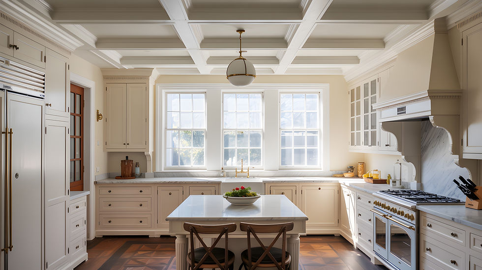
One of the things we are seeing dwindle in design decisions is bright, all white kitchens. People are craving warmth and a welcoming atmosphere in their homes, so light earth tones are replacing the neutral color choices of previous designs (Elle Decor).

As we discussed in our first ever Kitchens By Design blog, more homes post-pandemic are multigenerational, and spending time together in the kitchen helps build cohesive family dynamics. Since the kitchen is the center of the home, creating a space that emulates a warmhearted atmosphere may seem unimportant but in reality is crucial. Kitchens By Design's lead designer Adrienne is currently working with a client who is leaning into the neutral earth tone color pallet. "My client wanted to stay with a bright airy feel since she was coming from a dark wood kitchen, therefore we chose a warmer white (not as sharp as a bright white paint) and we warmed it up by making the island a light brown colored cabinet (Timber stain by Fabuwood)," Adrienne explains. "My client fell in love with the Pental Quartz countertop called Tramonto, which has a hint of beige in the slabs. I came across this new tile we started carrying that picked up the beige in the counters perfectly (Ragno Tile's Amuri Collection). It also warmed up the white cabinets that are on the border of the kitchen."


You can view our designer Adrienne’s consultation process as well as the products in our showroom by watching this reel on our Instagram.
There are a few different ways designers and homeowners are utilizing tile that we are seeing as we enter the new year. Large format tile as well as statement countertops are being sought after more often. While white marble/quartz counters have not been sidelined, dramatic veining and statement colors are becoming a staple style. There are a couple of different ways to utilize this color trend. Sometimes the veining is mild and colorful, such as this white quartz countertop Suprema Carmela with gold veins from Viatera (image #1), or bold and dramatic like Cambria Quartz’s Bentley (image #2).


Large tiles are a gorgeous alternative to intricate backsplash tile work, as well. While giving a semi-illusion of solid slabs, large tiles create a clean - yet still dynamic - visual. Adrienne recommends using a solid color, such as this 4x16 tile from Anatolia Tile's Soho collection in Cloud Blue.

Another trend brushing white out of the way is something called color drenching. Whether the colors are big and bold or more muted, one primary color utilized throughout the entire space is becoming more popular as we move into 2025. Saturated paint colors - especially in a high lacquer finish - paired with wood tones adds a sense of luxury, as well as a permanent stamp of the homeowner’s personality, according to Martha Stewart (“Big Color”) and Veranda (“Moody Colors”).

If jewel tones such as sapphire or oxblood are not your vibe, slightly calmer colors such as navy or sage green are excellent alternatives. This is another trend we are seeing live at Kitchens By Design! We are currently working with a client who is drenching their kitchen with forest green and light toned wood.

We are so excited to see how our new clients in 2025 take advantage of this dynamic evolution of color! There is no need to shy away from showing off your personality in your kitchen design. As we move into a new year, shifts in trends are ever present and highlighted throughout the industry. Ultimately, using color in bold ways is one of the more prominent transformations we are seeing. Whether you are a neutral earth toned lover or you are obsessed with loud, assertive colors, there are so many ways to incorporate your favorites into your kitchen design. From statement tile to color drenching, the world is your oyster.
Ready to conquer a colorful kitchen design?


Comments